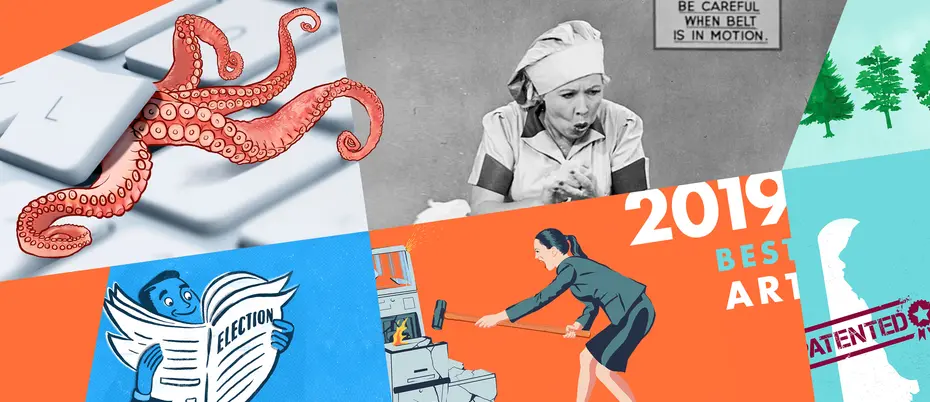
2019, illustrated
Illustration, photography, and art direction bring out the meaning, insight, and humanity of the most important management ideas.
Illustration does a lot of work when we write about ideas. We don’t always see ideas in the traditional sense, but a skilled artist gives them visual meaning and helps readers think creatively about applying ideas to their own work. At Ideas Made to Matter, we turn to illustrators to capture the mood and the meaning of what we write about. Here are six of the illustrations and photos we loved in 2019.
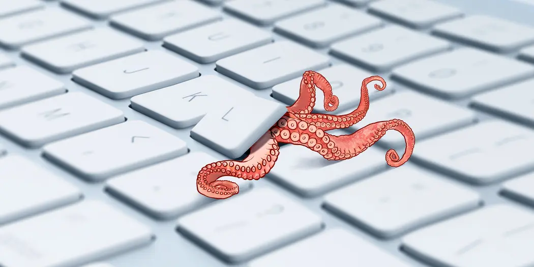
Credit: Rob Dobi
These are the cyberthreats lurking in your supply chain
Keeping hackers out is not enough. Organizations often fail to consider third-party or supply chain cybersecurity attacks — originating, intentionally or unintentionally, with outside individuals, contractors, firms, or groups that are authorized to access an organization’s systems. With the rise of the “internet of things” and the number of internet-connected devices, we are vulnerable to these attacks now more than ever. And Stuart Madnick, a professor of information technologies at MIT Sloan, believes “the worst is yet to come.”
We took a fresh, creative approach to illustrate the complex world of supply chain cybersecurity. Instead of the typical swarm of bugs, security padlock, or masked hacker, we employed the unassumingly intelligent octopus — a creature that has dumbfounded scientists for their ability to disguise, escape, and remember patterns. Rob Dobi brilliantly illustrates a lurking octopus emerging from a keyboard. The result is a little fantasy and a lot alarming. – Mimi Phan, assistant art director
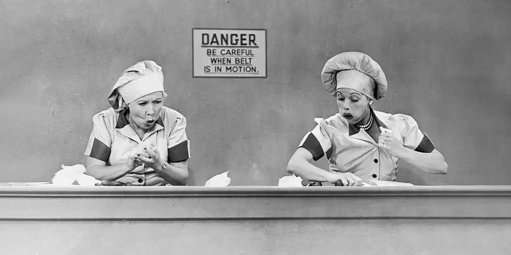
Credit: CBS Photo Archive/Getty Images
An 8-step guide for improving workplace processes
In an iconic scene from “I Love Lucy,” Lucy and Ethel take a shift at a candy factory and end up over their heads. Chocolates fly down the assembly belt waiting to be wrapped while the duo shovel sweets into their confectioners’ caps. It’s hilarious, and it perfectly illustrates what it’s like to be overwhelmed at work.
In knowledge workplaces it can be hard to see when people are behind or processes are failing. Work piles up in email inboxes instead of on assembly lines. To address this, Amy Kimball and Daniel Norton, both EMBA ’19, created a process to improve processes, an eight-step plan that can be replicated at any workplace. They illustrated their project presentation with the “I Love Lucy” scene, which inspired us to use it for our story illustration. We can all imagine our work piling up like those chocolates, and ourselves as Lucy and Ethel trying to keep up. – Sara Brown, news writer
Credit: iStock / saemilee
Why ESG ratings vary so widely (and what you can do about it)
More and more, ESG — environmental, social, and governance — is moving from the feel-good fringes to the center of business decision-making, as shareholders and customers alike expect more than just profits from the companies they do business with. But research from MIT Sloan found that ESG ratings vary widely, making it difficult to determine which firms are succeeding in their efforts toward sustainability.
While the article is very much about data — and how companies can resolve the discrepancies in ESG rankings — corporate social responsibility always involves a blend of evidence and emotion. Assistant art director Mimi Phan manipulated this watercolor illustration to capture both those elements beautifully. Each tree is unique and equal, yet together they add up to something more powerful, a gentle visual reminder of the power of ESG standards and practices. – Tracy Mayor, senior editor and writer
Credit: Rob Dobi
A 4-step plan for fighting social media manipulation in elections
Since the 2016 U.S. presidential election, the role of social media in our democratic process has become an increasingly regular topic of conversation. The recent debate over political ads on social media has seen Facebook and Twitter take opposing sides on the issue and demonstrates that we’ve only just begun to explore the many ways in which these platforms have the capacity to shape elections.
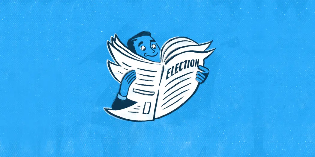
But MIT’s Sinan Aral and Dean Eckles have a plan to fight back against social media manipulation in elections. The first step? Identify which social messages have been affected and why. That may sound straightforward enough, but in the era of fake news, being able to recognize and agree on the problem can be a challenge in itself. Similarly, Rob Dobi’s sly alteration of the newspaper in his illustration may not be apparent at first glance, but a second look reveals its true form. – Devon Maloney, social media editor
Credit: Rob Dobi
The lure of “so-so technology,” and how to avoid it
Struggling with technology can feel like a personal failing, one tied to the anxiety and dread of aging. But much of the time, it isn’t you. It’s the tech.
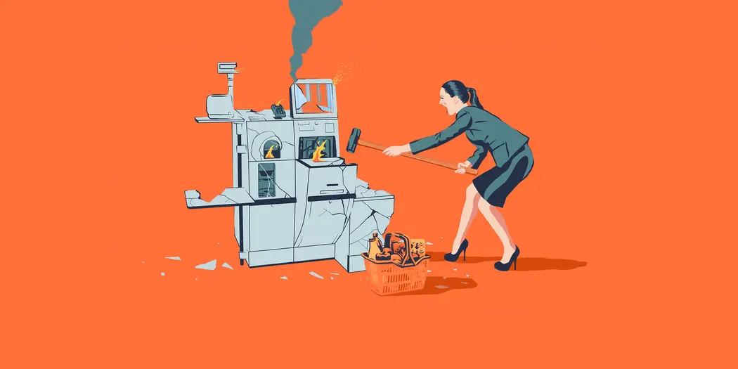
Rob Dobi’s illustration of how we so often feel confronting a self-checkout machine feels like an affirmation — a reminder that it’s not our fault. This is quintessential “so-so technology,” as defined by MIT economist Daron Acemoglu. “So-so technologies” are technological advances that disrupt employment and displace workers without generating much of a boost in productivity. This tech is not just at the drug store. It’s in our workplaces and our homes, messing with the day and demanding to be obliterated. It’s automation for the sake of automation and product managers should do everything they can to avoid building it. – Zach Church, editorial director
2 strong predictors of startup success
No two startups are created equal, but after looking at more than 10 million U.S. business registrations from 1995 – 2005, a pair of MIT Sloan entrepreneurship and strategy professors found some common denominators for successful firms.
Christian Catalini and Scott Stern observed that founders who registered in Delaware and acquired a patent and trademark protection were “278 times more likely to achieve an equity growth event than firms that are associated with none of these choices.”
Translating this conclusion into art took creative brainstorming from our assistant art director Mimi Phan. The trademark symbol — in her words — would “look really boring,” and she didn’t want the graphic to look too much like a state logo. The result was a conceptual image that grabs attention with a bright turquoise background, and entices readers to find out what a patent stamp and small state have to do with each other. — Meredith Somers, news writer
