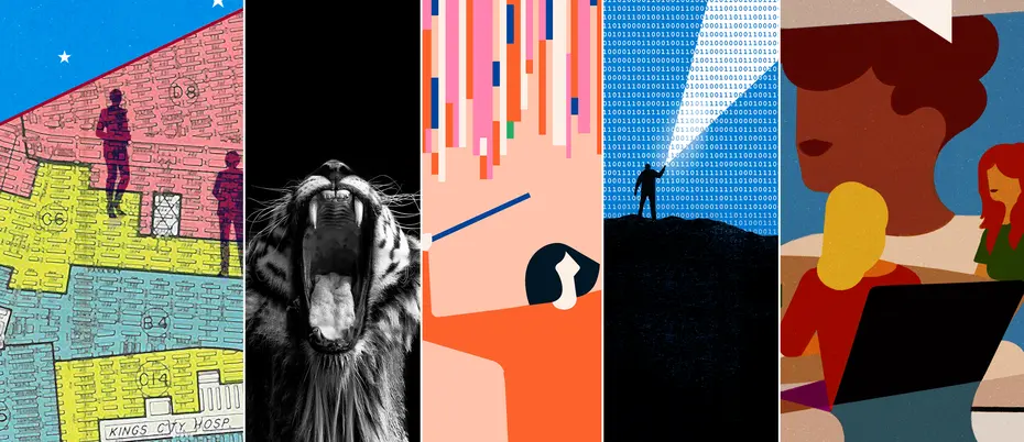
2021, illustrated
Illustration, photography, and art direction bring out the meaning, insight, and humanity of the most important management ideas.
Editorial art can be visually striking, but the most effective work helps to tell the story. That’s the case with our favorite art of the year: It demands the reader’s attention and elevates the words on the page. In 2021, we turned to artists to help us paint a clearer picture of complicated topics such as data analytics, artificial intelligence, and managing in a hybrid workplace.
Here are the illustrations we loved this past year.

Credit: Rob Dobi
The hidden work created by artificial intelligence programs
So much of what I see online every day is driven by algorithms. Data and artificial intelligence dictates things like the posts and ads I’m shown on my social media feeds, the shows Netflix recommends I watch, and which items an online store might think I'd like.
For all the things we see, the data-driven world obscures a lot. In addition to the actual data and algorithms that create apparently seamless online interactions, and marginalized groups who can be harmed by new technology, there are also the “ghost workers” of AI. These include the people who are coding data, flagging problematic images, and working to integrate AI and new technology into workplaces. Our story about these workers was accompanied by Rob Dobi’s illustration of a person on a dark mountain, shining a flashlight through a sky full of code. This stark image reminds us that there’s a lot in the digital landscape that is obscured from our eyes. Researchers and AI workers are shining a light on these things, though, and we should all be paying attention. — Sara Brown, news writer

Credit: iStock
A cultural clue to why East Asians are kept from US C-suites
MIT Sloan assistant professor Jackson Lu’s work on East Asian underrepresentation in leadership positions highlights the challenge of cultural differences in assertiveness.
Assistant art director Mimi Phan and I wanted to illustrate Lu’s research, and also catch the eye of our readers. I pictured a drawing of an open mouth, sort of like the pop art of Roy Lichtenstein. Mimi suggested a lion mid-roar, to represent the “king of the jungle” dominance at the heart of the research. We ultimately decided on a tiger for its power and strength, and the striking beauty of the image. I think Mimi puts it best: “It almost has that ‘Enough is enough, I’m going to scream!’ vibe, especially for people that don’t have an aggressive style of leading.” — Meredith Somers, news writer

Credit: Jennifer Tapias Derch
Data and analytics, colorfully conveyed
Data and analytics are affecting every industry and it’s only just the beginning. Yet, the topics are not always easy to understand. What I loved about Jennifer Tapias Derch’s illustrations for our data analytics series this year is she not only made data beautiful, she made it approachable. Instead of your typical binary code, numbers, or complicated algorithms, she used fun geometric shapes and the happiest color palette. And she used just enough to convey the topics so clearly. This is what most artists strive for — the perfect number of elements to convey the idea, never less and never more. Jennifer perfected it for each article in the series using her bold, vibrant, and whimsical style.
Highlights include a person holding a net and catching all different kinds of geometric shapes representing unstructured data. Two people exchanging blocks of data from their own square rooms, almost like Romeo and Juliet, except it’s external data and not love notes. And finally, as Devon details below, a conductor working a symphony of rectangular-shaped data: the perfect metaphor for how one needs a chief data officer to lead a successful data transformation. The bars of music and shapes of data truly sang to us. — Mimi Phan, assistant art director

Credit: Jennifer Tapias Derch
Making the business case for a chief data officer
At Ideas Made to Matter, we write a lot about data – and with good reason. It’s one of our most popular subjects with readers, and the ability to work capably and efficiently with data is an increasingly essential skill in our digitized world.
Business leaders have made huge strides in acknowledging the critical role data plays within their organizations. According to a 2021 survey, only 12% of companies had a chief data officer in 2012. In 2021, 65% of companies have a CDO. And while there remains a lack of clarity over what exactly falls within the CDO’s domain, research shows that successful data executives are those who guide strategic decision-making and help transform business processes.
The artwork by Jennifer Tapias Derch puts a whimsical spin on this theme, as our steadfast CDO deftly conducts stalactites of data pixels of all sizes and colors. What might have otherwise dissolved into a messy cacophony of metrics is instead orchestrated seamlessly into an orderly and harmonious production. – Devon Maloney, social media editor
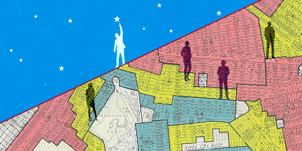
Credit: Mimi Phan / Map details from The 1938 Home Owners’ Loan Corporation map of Brooklyn, NY. Courtesy of National Archives and Records Administration.
New narratives and policy for diverse entrepreneurship
The American bootstrap narrative credits successful entrepreneurs with vision and hustle, while ignoring the boost they get from high-quality education, generational wealth, home-equity loans, and more.
“People tend to tell their story through ‘I did this, I did that,’ as opposed to ‘Look at this help that I got,’” Chuck Collins, a director at the Institute for Policy Studies, said in an MIT Sloan discussion this year.
Meanwhile, government support for vulnerable communities is framed as charity. Policies are meant to help, but they should be designed to invest.
Using a 1938 Brooklyn map, visual artist Mimi Phan delineates between entrepreneurs who are allowed to try and those who are left interminably waiting. The original map was used for the discriminatory practice of redlining, which prevents people of color from obtaining mortgages and bank loans.
Redlining is still a thing. Our false narratives create racially concentrated areas of affluence, communities that benefit from and reinvest in the American bootstrap narrative. Elsewhere, many wait for the opportunity to tell their own story. – Zach Church, editorial director

Credit: Andrea Mongia
How to keep remote workers from feeling disconnected
In a year when worrisome headlines and dystopian images just kept coming, this article and its accompanying artwork landed like a sunny Caribbean afternoon when we needed it most. Published just as companies were beginning to articulate their strategies for returning at least some employees to in-person work, news writer Meredith Somers culled best practices from firms like Salesforce, Cisco, and GitHub to guide organizations in creating a hybrid workplace based on inclusivity and consideration for each employee’s needs and situation.
Drenched in color, the accompanying image by visual artist Andrea Mongia represents a platonic ideal of 21st century employee collaboration. In a direct repudiation of 18 months of coworkers boxed and stacked up like so many Brady Bunch siblings, Mongia depicts a casual, inviting, diverse atmosphere where in-office and remote teammates occupy equal space — and are able to be equally productive. Yes, please. – Tracy Mayor, senior news writer and editor